Getting Started
Last week I made a business card. I’m a college student and I have a business card. Is that weird? I don’t think so, and I’m glad I finally made one. I first tried to design a business card when I was a senior in high school taking a basic graphic design course, but I didn’t like the end product and didn’t have the money (or the need, really) to print the business cards that I wanted. So, I shelved the idea for a year and a half, then made a business card last week.
Since I hadn’t touched Photoshop in nearly two years and wasn’t too good at it when I was using it, I knew I wanted a guide for creating my business card. I found a comprehensive guide from Thomas Frank on CollegeInfoGeek that I was able to use for determining parameters and learning the tools to use within Photoshop. I didn’t follow the guide exactly, but it helped me along.
Initial Designs
On the first day, I made two front designs.
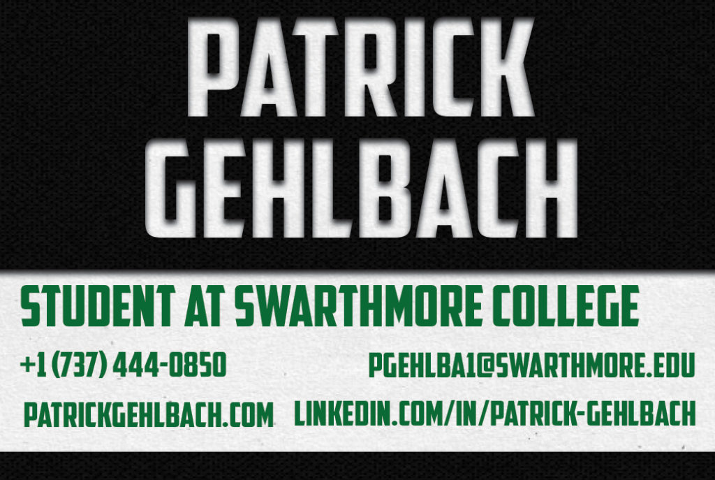

I made one design for the back of the card and used it for all of the designs. Since I want my business card to have a back that someone can write on, so that affects the back design of the card and the material I choose for printing. I like a simple dot grid pattern more than blank white.

For the first front side and the backside, I used free patterns that I found on Subtle Patterns. For the second card, I found two free photos on Unsplash. See the resources below for links to the originals.
Refining the Design
After making the two front designs on my first day, I stopped developing the second design. Though I love wood and the way it looks on a business card, it isn’t the style I want across my cards, website, etc. Therefore, I continued designing my first frontside design. The initial design used clipping masks, layering, text boxes, and inner shadowing, but wasn’t complete. On the second day, I changed the pattern used for the clipping mask (the white background), added drop shadows to the text with my details, and changed the tagline to be more descriptive. I made a couple of designs.
This second design kept the darker text color that I used on the first iteration but had a drop shadow added to the text.
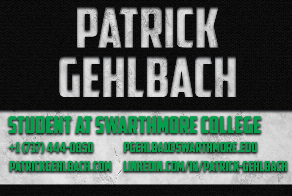
The third iteration has a drop shadow on the detail text, as well, but I lightened the text, changed the tagline, and added a safe zone around the edges of the card (some will be cut off during printing).

With a design in hand, I thought I was ready to have my cards printed, but I decided to wait another day. I didn’t like the tagline on the third iteration because I don’t consider myself an entrepreneur or a dedicated blogger (yet) and because I think, as a college student, I should highlight my school and class year. I made one last iteration and it’s what I had printed.

Printing My Business Card
For printing, I went to MOO. Initially, I wanted my cards printed on MOO’s Cotton Business Cards in a standard size (3.5″x2.0″) with rounded corners, but MOO had a sale running, so I decided to use the Luxe Business Cards (standard size, rounded corners). I ordered fifty cards because I don’t need many, am on a tight budget, and want to try MOO before ordering bulk. In the future, I will try the cotton cards (they’re recycled, hooray for that) and I look forward to having the Luxe cards when they arrive.
I bought a simple, leather business card holder from TXesign Direct on Amazon. If you see me on the street, ask for one!
Resources
Note: None of the links in this post are affiliate links.
- Thomas Frank’s guide is helpful for designing a card. He pointed the way to Subtle Patterns and the American Captain font, alongside guiding through Photoshop.
- I used Adobe Photoshop 2020. Any version of Photoshop will probably work and there may be other, cheaper programs you can use, too. I downloaded Photoshop for a 7-day free trial, then canceled my subscription before the first bill.
- I browsed through every page of patterns on Subtle Patterns and downloaded dozens of free patterns. In my final design, I used Blach Orchid by Hybridixstudio on the front of my card and Dot Grid by Darius Garza on the back of my card.
- I love browsing Unsplash to see amazing photography. The rock background I used for my clipping layer on my final card is by Scott Webb on Unsplash.
- I used the American Captain font by Michael G. Adkins on Dafont. It’s free for personal use, but I doubt it’s free for commercial use.
- I used MOO for printing my business cards. MOO has a variety of options for cards and I think I will use them again.
- I bought a leather business card holder from TXesign Direct on Amazon. There are many cardholders available online and in stores. The cardholder I chose isn’t special and might not last, but I like the design.
- Note: I used an inactive phone number.